
Product cards
This section allows you to customize the appearance and behavior of product cards across collection pages and featured sections. It helps you control how product information is displayed and how users interact with products.
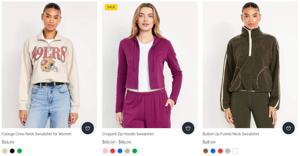
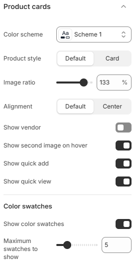
- Color scheme: Select the color scheme applied to product cards.
- Product style: Choose between Default and Card layout styles to control the overall appearance of product items.
- Image ratio: Set the image aspect ratio (height divided by width) to control how product images are displayed.
- Alignment: Define the content alignment within the product card. Choose between Default and Center.
- Show vendor: Display the product vendor/brand name on the product card.
- Show second image on hover: When enabled, a secondary product image will appear when hovering over the product.
- Show quick add: Enable a quick add-to-cart button directly on the product card.
- Show quick view: Enable a quick view option to preview product details without leaving the page.
- Show color swatches: Display available color options as swatches on the product card.
- Maximum swatches to show: Limit the number of color swatches displayed to keep the layout clean.
Use a consistent image ratio and alignment to maintain a clean grid layout. Enabling interactive features like quick add or hover effects can improve user experience, but avoid overcrowding the product card to keep it clear and easy to scan.