
Sections
What is a Section in a Shopify Theme?
In Shopify, a section is a modular and reusable content block used to build page layouts. Each section represents a specific type of content, such as a banner, product list, slideshow, FAQ, or custom content area.
Sections can be added, removed, reordered, and customized directly within the Theme Editor, allowing merchants to design and manage their storefront without writing code.
Common Section Structure
All sections in this theme follow a consistent structure to ensure a unified design system and a better user experience. Each section is divided into the following parts:
Section header
The Section header controls the main introductory content of a section, including the heading, description, and optional button. It helps communicate the purpose of the section and guides users with clear text and call-to-action elements.
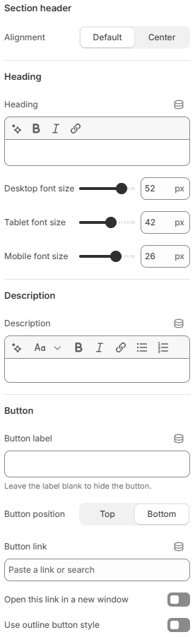
- Alignment: Controls the alignment of the header content. Options typically include default or centered layout.
- Heading: Defines the main title of the section. This is the primary text users see to understand the section’s purpose.
- Desktop font size: Adjusts the heading font size for desktop devices.
- Tablet font size: Adjusts the heading font size for tablet devices.
- Mobile font size: Adjusts the heading font size for mobile devices.
- Description: Adds supporting text below the heading to provide more context or details about the section.
- Button label: Sets the text displayed inside the button. Leaving this field empty will hide the button.
- Button position: Determines where the button appears relative to the header content (e.g., top or bottom).
- Button link: Specifies the destination URL or page the button will link to.
- Open this link in a new window: Enables opening the button link in a new browser tab.
- Use outline button style: Switches the button style to an outlined version instead of a solid background.
Section design
The Section design controls the visual appearance of a section. It allows you to customize the background and apply predefined color schemes to ensure consistency with the overall theme design.
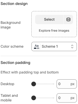
- Background image: Allows you to upload or select an image to be used as the background of the section.
- Color scheme: Lets you choose a predefined color scheme (e.g., Scheme 1) that applies colors for text, background, and other elements within the section.
Section padding
The Section padding controls the inner spacing at the top and bottom of a section. It helps create proper breathing space between the section content and its boundaries, improving layout balance and readability across different devices.
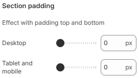
- Desktop: Adjusts the top and bottom padding of the section on desktop devices.
- Tablet and mobile: Adjusts the top and bottom padding of the section on tablet and mobile devices.
Section margin
The Section margin controls the outer spacing above a section. It is used to adjust the distance between sections, helping create a clean and well-structured layout across the page.
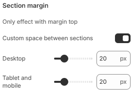
- Custom space between sections: Enables or disables custom spacing between sections. When enabled, you can manually adjust the margin values.
- Desktop: Adjusts the top margin of the section on desktop devices.
- Tablet and mobile: Adjusts the top margin of the section on tablet and mobile devices.
Section layout
The Section layout controls the overall structure and width behavior of a section. It allows you to define how the section spans across the page, how wide the content area is, and how the content is aligned.
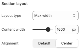
- Layout type: Determines how the section is displayed across the page.
Full width no padding: The section spans the full width of the screen without any horizontal padding.
Full width with padding: The section spans the full width of the screen with inner spacing on the sides.
Max width: The section content is constrained within a maximum width. - Content width: Sets the maximum width of the content area (in pixels) when using the Max width layout.
- Alignment: Controls the horizontal alignment of the section content, such as default or centered alignment.
The structure above is shared across all sections in this theme.
All common section parts (Section header, Section body, Section design, Section padding, Section margin, and Section layout) are documented once in this section and will not be repeated in the detailed documentation of individual sections.
This approach keeps the documentation clean, avoids redundancy, and allows each section’s documentation to focus only on its unique features.