
Multicolumn
The Multi Column section allows merchants to display content in a flexible multi-column layout. This section is ideal for showcasing services, features, brand values, categories, promotional content, or informational highlights in a clean and organized structure.
Each column inside the section is created using an Item block, allowing merchants to build fully customizable content layouts with images, headings, text, and additional elements depending on the block configuration.

Settings
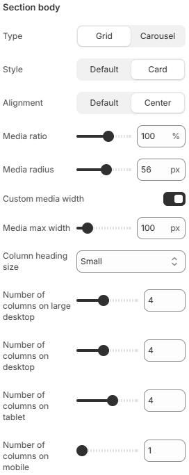
- Type: Controls the display layout of the section. Available options include Grid and Carousel layouts.
- Style: Defines the visual appearance of column items. Available options include Default and Card styles.
- Alignment: Controls the alignment of content inside column items. Available options include Default and Center alignment.
- Media ratio: Controls the aspect ratio used for media displayed inside column items.
- Media radius: Adjusts the corner radius of images or media elements.
- Custom media width: Enables custom width settings for media displayed inside column items.
- Media max width: Controls the maximum width size of media elements when custom media width is enabled.
- Column heading size: Defines the heading size used inside column items.
- Number of columns on large desktop: Controls how many columns are displayed on very large desktop screens.
- Number of columns on desktop: Defines the column layout displayed on desktop devices.
- Number of columns on tablet: Adjusts the number of columns displayed on tablet devices.
- Number of columns on mobile: Controls the number of columns displayed on mobile devices for responsive layouts.
Block: Item
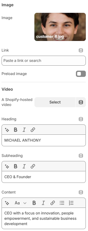
- Image: Uploads the image displayed inside the column item.
- Link: Defines the destination URL for the column item or media content.
- A Shopify-hosted video: Uses a Shopify-hosted video instead of an image inside the column item.
- Heading: Defines the main title displayed inside the column item.
- Subheading: Adds secondary text displayed above or below the heading.
- Content: Adds descriptive text or supporting information inside the column item.
Using balanced column layouts, responsive spacing, and consistent media styling can help create a cleaner and more visually organized storefront experience across all screen sizes.