
Inputs
This section allows you to customize the appearance of form elements such as text fields and select boxes. These settings help ensure a consistent and user-friendly input experience across your store.
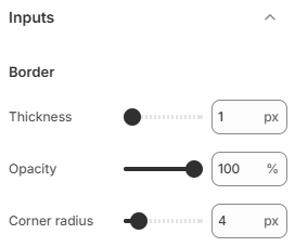
- Border thickness: Set the thickness of the input borders. Higher values make inputs more visually defined.
- Border opacity: Adjust the transparency of the input borders. Lower opacity creates a softer, more subtle look, while higher opacity makes borders more visible.
- Corner radius: Control the roundness of input corners. Increasing the value creates a more rounded appearance, while decreasing it results in sharper edges.
Use subtle borders and appropriate contrast to keep inputs clear without overwhelming the design. Consistent styling between buttons and inputs will help create a cohesive and professional interface.