
Announcement dropdown
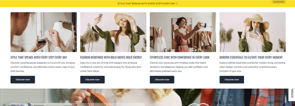
The Announcement Dropdown section helps merchants display important promotions, featured collections, store benefits, or marketing messages in an interactive dropdown layout. Instead of using a simple static announcement bar, this section creates a richer shopping experience by allowing customers to explore additional content directly from the store header.
This section is ideal for increasing promotion visibility, highlighting special campaigns, improving navigation, and presenting multiple content blocks in a clean and organized layout. The dropdown content is built using flexible section blocks, allowing merchants to add banners, links, collections, images, and promotional content inside the dropdown area.
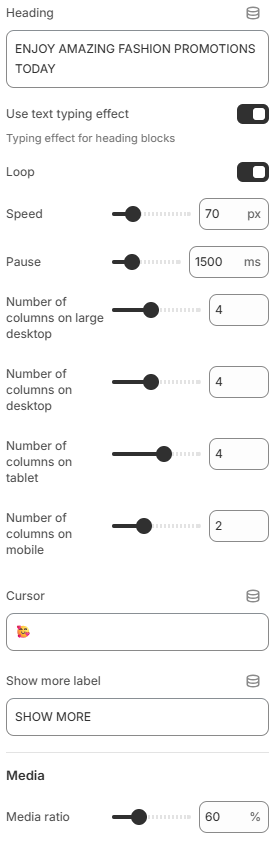
- Heading: Defines the main announcement text displayed in the announcement bar
- Use text typing effect: Enables a typing animation effect for heading text blocks to create a more dynamic and attention-grabbing appearance.
- Loop: Allows the typing animation to continuously repeat when the typing effect feature is enabled.
- Speed: Controls the typing animation speed in milliseconds. Lower values create faster typing effects, while higher values create smoother and slower animations.
- Pause: Sets the delay time before the typing animation restarts when looping is enabled.
- Number of columns on large desktop: Defines how many content columns are displayed inside the dropdown on very large desktop screens.
- Number of columns on desktop: Controls the dropdown column layout for standard desktop devices.
- Number of columns on tablet: Adjusts the number of columns displayed on tablet devices for better spacing and readability.
- Number of columns on mobile: Defines the dropdown column layout on mobile devices to ensure a responsive and user-friendly experience.
- Cursor: Allows customization of the cursor icon used within the section for a more interactive and branded appearance.
- Show more label: Customizes the label text used for expanding or revealing additional dropdown content.
- Media ratio: Controls the image aspect ratio used inside media blocks within the dropdown content area.
Section block: Item
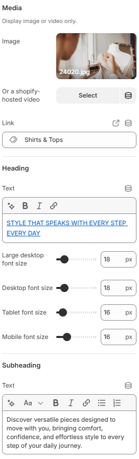
- Image: Allows you to upload and display an image inside the dropdown block.
- Shopify-hosted video: Lets you use a Shopify-hosted video instead of an image to create more engaging promotional content.
- Link: Defines the destination URL when customers click the media block or related content.
- Heading
Text: Adds the main heading content for the block. This is typically used to display promotional titles, featured collection names, or marketing messages.
Large desktop font size: Controls the heading font size on large desktop screens.
Desktop font size: Defines the heading font size for standard desktop devices.
Tablet font size: Adjusts the heading font size for tablet devices to maintain readability and layout balance.
Mobile font size: Controls the heading font size on mobile devices for a responsive viewing experience. - Subheading
Text: Adds supporting text below the heading. This area is commonly used for short descriptions, promotional details, or additional marketing information related to the block content.
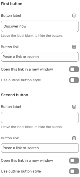
The section block supports two buttons with identical settings, allowing merchants to add multiple call-to-action options inside the dropdown content.
- Button label: Defines the text displayed on the button. Leave empty to hide the button.
- Button link: Sets the destination URL for the button.
- Open this link in a new window: Opens the button link in a new browser tab or window when enabled.
- Use outline button style: Applies an outline-style button design instead of a solid button style.
Using clear button labels and limiting the number of actions within a single block can help create a cleaner and more user-friendly shopping experience.
A well-designed Announcement Dropdown section can significantly improve customer engagement and promotional visibility. For the best results, use short and clear announcement text, maintain a balanced column layout across devices, and choose colors that provide strong contrast with the header background. Combining clean typography, consistent media ratios, and subtle animation effects can help create a modern and professional shopping experience while keeping the storefront easy to navigate.