
Featured collection
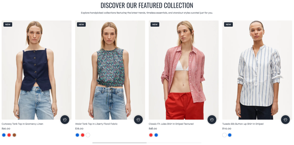
The Featured Collection section allows merchants to showcase selected products from a specific Shopify collection directly on the storefront. This section is ideal for highlighting new arrivals, trending products, seasonal collections, best sellers, or curated product groups to increase product visibility and customer engagement.
The section supports both Grid and Carousel layouts, providing flexible product presentation styles for different storefront designs and shopping experiences.
Settings
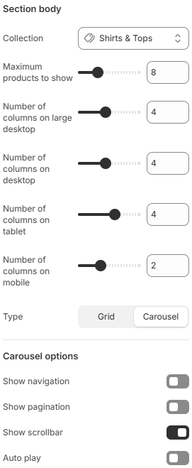
- Collection: Selects the collection used for displaying featured products.
- Maximum products to show: Limits the total number of products displayed inside the section.
- Number of columns on large desktop: Defines how many product columns are displayed on very large desktop screens.
- Number of columns on desktop: Controls the product grid layout displayed on desktop devices.
- Number of columns on tablet: Adjusts the product layout for tablet devices.
- Number of columns on mobile: Defines the number of product columns displayed on mobile devices.
- Type: Controls the product display layout. Available options include Grid and Carousel.
- Carousel Options
These settings are used when the Carousel layout type is selected.
Show navigation: Displays carousel navigation arrows.
Show pagination: Displays pagination indicators below the carousel.
Show scrollbar: Displays a draggable scrollbar for the carousel.
Auto play: Automatically scrolls products inside the carousel when enabled.
Using carefully selected collections, balanced product layouts, and responsive carousel settings can help improve product discovery while creating a cleaner and more engaging storefront experience.