
Buttons
This section allows you to customize the appearance of buttons across your store, including text style and border design. These settings help ensure your buttons are visually consistent and aligned with your brand style.
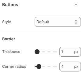
- Style: Control the text transformation of buttons. You can choose between Default, Capitalize, or Uppercase to match your design preference.
- Border thickness: Set the thickness of the button border. Increasing the value makes the border more prominent.
- Corner radius: Adjust the roundness of button corners. A higher value creates more rounded buttons, while a lower value results in sharper edges.
Choose a button style that aligns with your brand identity and maintains good readability. Consistent border and radius values help create a polished and professional look across all interactive elements.