
Feature list
The Feature List section allows merchants to display a list of highlighted services, store benefits, featured collections, or important promotional links in a clean and organized layout. This section is ideal for improving storefront navigation, emphasizing key selling points, or showcasing important categories and services.
The section supports both grid and carousel layouts, making it flexible for different storefront designs and responsive across all device sizes.
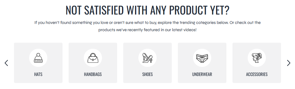
Settings
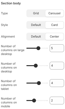
- Type: Controls the display layout of feature items. Available options include Grid and Carousel.
- Style: Defines the visual appearance of feature items. Available options include Default and Card styles.
- Alignment: Controls the content alignment inside feature items. Available options include Default and Center alignment.
- Number of columns on large desktop: Defines how many feature columns are displayed on very large desktop screens.
- Number of columns on desktop: Controls the feature grid layout on desktop devices.
- Number of columns on tablet: Adjusts the feature layout for tablet devices.
- Number of columns on mobile: Defines the number of feature columns displayed on mobile devices.
Block: Item
Each feature inside the section is created using a Feature Item block.
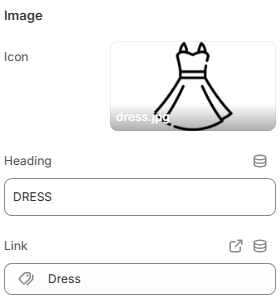
- Icon: Selects the icon displayed for the feature item.
- Heading: Defines the main title or label displayed for the feature item.
- Link: Sets the destination URL for the feature item.
Using concise headings, recognizable icons, and balanced layouts can help improve storefront navigation and make important services or featured collections easier for customers to discover.