
Slideshow
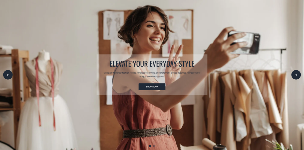
The Slideshow section allows merchants to display promotional slides, featured banners, collections, or marketing content in an interactive slider layout. This section is ideal for highlighting important campaigns, seasonal promotions, new arrivals, or brand storytelling while creating a visually engaging storefront experience.
With responsive media controls and customizable slider behavior, the slideshow can adapt smoothly across desktop, tablet, and mobile devices.
Settings
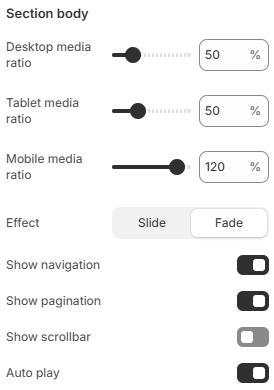
- Desktop media ratio: Controls the media aspect ratio displayed on desktop devices.
- Tablet media ratio: Adjusts the media aspect ratio for tablet screens to maintain responsive layouts.
- Mobile media ratio: Defines the media aspect ratio displayed on mobile devices for better viewing experiences on smaller screens.
- Effect: Controls the slide transition animation style. Available options include Slide and Fade effects.
- Show navigation: Displays previous and next navigation buttons for manual slide control.
- Show pagination: Displays pagination indicators to show the current slide position.
- Show scrollbar: Enables a scrollbar indicator for the slideshow.
- Auto play: Automatically rotates slideshow items without requiring customer interaction.
Block: Item
Each slide inside the Slideshow section is created using an Item block. These blocks allow merchants to add responsive images or videos along with customizable content positioning and alignment settings for different screen sizes.
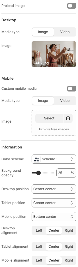
- Preload image: Enables image preloading to help slides load faster and improve visual performance.
- Desktop
Media type: Defines whether the slide uses an image or video on desktop devices.
Image: Uploads the desktop media displayed inside the slide.
Shopify-hosted video: Lets you use a Shopify-hosted video instead of an image to create more engaging promotional content. - Mobile
Custom mobile media: Allows merchants to use separate media specifically optimized for mobile devices.
Media type: Defines whether the slide uses an image or video on desktop devices.
Image: Uploads the desktop media displayed inside the slide.
Shopify-hosted video: Lets you use a Shopify-hosted video instead of an image to create more engaging promotional content. - Information
Color scheme: Controls the color styling used for the slide content area.
Background opacity: Adjusts the opacity level of the content background overlay to improve text readability over media.
Desktop position: Controls the content position inside the slide on desktop devices.
Tablet position: Defines the content position for tablet layouts.
Mobile position: Adjusts the content position on mobile devices.
Desktop alignment: Controls the horizontal text alignment on desktop devices.
Tablet alignment: Defines the text alignment for tablet screens.
Mobile alignment: Controls the text alignment displayed on mobile devices.
- Heading
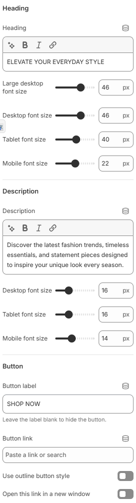
Heading: Defines the main heading text displayed inside the slideshow item.
Large desktop font size: Controls the heading font size on large desktop screens.
Desktop font size: Defines the heading font size for desktop devices.
Tablet font size: Adjusts the heading font size displayed on tablet devices.
Mobile font size: Controls the heading font size on mobile devices for better responsiveness. - Description
Description: Adds supporting text displayed below the heading inside the slideshow item.
Desktop font size: Controls the description text size on desktop devices.
Tablet font size: Defines the description font size for tablet layouts.
Mobile font size: Adjusts the description font size on mobile devices. - Button
Button label: Defines the text displayed on the slideshow button. Leave this field empty to hide the button.
Button link: Sets the destination URL for the button.
Use outline button style: Applies an outline-style button appearance instead of a solid button style.
Open this link in a new window: Opens the button link in a new browser tab or window when enabled.
A well-designed slideshow can help create a stronger first impression and improve customer engagement throughout the storefront. For the best results, use high-quality media, concise promotional text, and clear call-to-action buttons that guide customers toward important collections or campaigns. Maintaining consistent typography, balanced content positioning, and responsive layouts across desktop and mobile devices can help create a more professional and visually appealing shopping experience.