
Header
The Header section is one of the most important parts of the storefront, providing primary navigation and access to key features such as menus, localization, and global settings. It appears at the top of every page and helps users navigate the store efficiently while maintaining brand consistency.

Settings
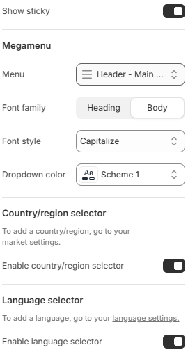
- Show sticky: Enables a sticky header that remains visible at the top of the screen when users scroll down the page.
- Menu: Selects the menu to display in the main navigation area.
- Font family: Defines the font style used for level 1 menu items. Available options include Heading and Body.
- Dropdown color: Applies a color scheme to the dropdown (megamenu) for consistent styling with the theme.
- Enable country/region selector: Displays a selector that allows users to choose their country or region, helping localize pricing and shopping experience.
- Enable language selector: Displays a language switcher that allows users to change the store language if multiple languages are available.
Header Mega Menu Blocks
The Header section supports flexible Mega Menu blocks, allowing merchants to build advanced dropdown navigation layouts inside the storefront header. These blocks can be combined together to create rich navigation experiences with images, products, collections, promotional banners, links, and custom content.
All Mega Menu blocks are displayed inside a responsive 12-column grid system. Each block can control its own layout width and display order within the dropdown menu.
All Mega Menu blocks share the following common settings.
- Index: Defines which top-level navigation item (menu level 1 item displayed inside the header navigation) the block will be attached to and affect.
- Column: Controls how many columns the block occupies inside the 12-column mega menu grid layout.
- Order: Defines the display order of the block inside the mega menu layout.
Mega Menu Grid System
The mega menu dropdown layout is built using a 12-column grid structure. Multiple blocks can be combined together inside the same dropdown menu, allowing merchants to create flexible layouts with different column widths and content arrangements.
For example:
- A block using
Column: 12will occupy the full width of the mega menu row. - A block using
Column: 6will occupy half of the mega menu width. - Multiple smaller blocks can be combined together to create more advanced layouts.
The Order setting determines how blocks are arranged visually inside the dropdown layout, making it easier to organize content priority and responsive positioning.
Block: Menu settings
The Menu Settings block controls the behavior and appearance of a top-level navigation item inside the Header mega menu system. This block directly affects the corresponding level top menu item displayed in the main header navigation.
Using this block, merchants can customize menu item visuals, badges, and dropdown behavior for individual navigation entries.
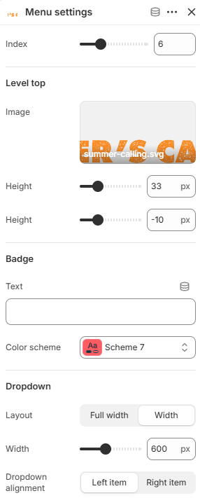
- Index: Defines which top-level navigation item (menu level 1 item displayed inside the header navigation) the block will affect. The index value starts from
1. - Level top
These settings control the appearance of the top-level navigation item displayed directly inside the header menu.
Image: Displays a custom image that replaces the default text of the top-level menu item inside the header navigation.
Height: Controls the height size of the image displayed inside the menu item.
Top: Adjusts the vertical position of the image relative to the menu item. - Badge
These settings allow merchants to display promotional badges or labels directly on the navigation item.
Text: Defines the badge text displayed on the menu item.
Color scheme: Controls the color styling used for the badge. - Dropdown
These settings control the dropdown mega menu layout attached to the navigation item.
Layout: Controls the dropdown layout style. Available options include Full width and Width.
Width: Defines the custom width size of the dropdown menu when using the Width layout option.
Dropdown alignment: Controls the horizontal alignment position of the dropdown relative to the navigation item. Available options include Left item and Right item.
Block: Menu banner
The Menu Banner block allows merchants to display promotional banner content directly inside the Header mega menu dropdown. This block is ideal for highlighting featured collections, campaigns, seasonal promotions, or marketing content while making the navigation area more visually engaging.
The banner can display images, headings, subheadings, and links with flexible positioning and layout controls inside the mega menu grid system.
- Image
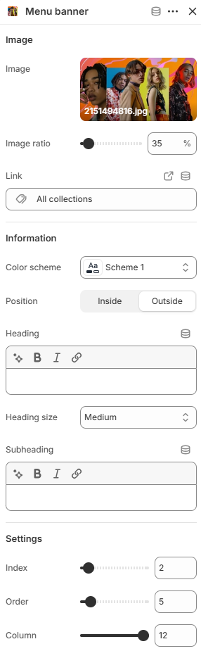
Image: Uploads the banner image displayed inside the mega menu.
Image ratio: Controls the aspect ratio used for the banner image.
Link: Sets the destination URL for the banner content. - Information
These settings control the content displayed on or around the banner image.
Color scheme: Controls the color styling used for the banner content.
Position: Defines where the banner information is displayed relative to the image. Available options include Inside and Outside.
Heading: Defines the main heading text displayed for the banner.
Heading size: Controls the size of the banner heading. Available size options depend on the theme configuration.
Subheading: Adds supporting text displayed below the heading. - Settings
Index: Defines which top-level navigation item (menu level 1 item displayed inside the header navigation) the block will affect. The index value starts from1.
Order: Defines the display order of the block inside the mega menu layout.
Column: Controls how many columns the block occupies inside the 12-column mega menu grid layout.
Block: Menu category
The Menu Categories block displays navigation categories and subcategories inside the Header mega menu dropdown. This block is useful for organizing large navigation structures into cleaner multi-column category layouts, helping customers browse collections and pages more easily.
The block automatically uses the navigation structure assigned to the corresponding top-level menu item and arranges submenu items inside the mega menu grid layout.
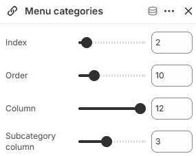
- Index: Defines which top-level navigation item (menu level 1 item displayed inside the header navigation) the block will affect. The index value starts from
1. - Order: Defines the display order of the block inside the mega menu layout.
- Column: Controls how many columns the block occupies inside the 12-column mega menu grid layout.
- Subcategory column: Controls how many columns are used for displaying submenu categories and subcategories inside the block.
Block: Menu brands
The Menu Brands block allows merchants to display brand entries directly inside the Header mega menu dropdown. This block uses the Shopify Metaobject structure from the Shop by Brand section, allowing merchants to dynamically showcase featured brands together with their related content and products.
This block is ideal for multi-brand stores that want to provide quick brand discovery directly from the main navigation menu.
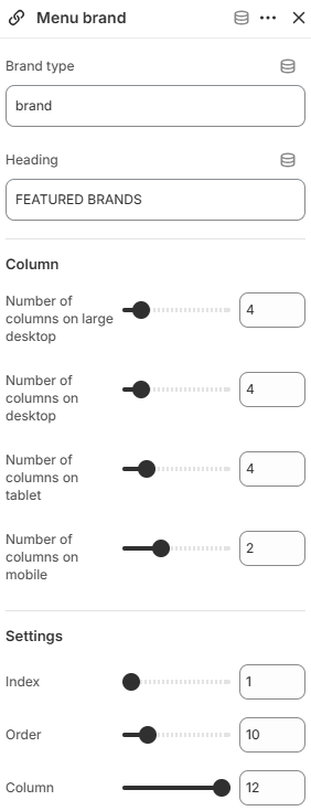
- Brand type: Defines the Shopify Metaobject type used for loading brand entries. This should match the Metaobject type configured for the Shop by Brand section.
- Heading: Defines the heading displayed above the brand list inside the mega menu.
- Column
These settings control the responsive brand grid layout displayed inside the mega menu.
Number of columns on large desktop: Defines how many brand columns are displayed on very large desktop screens.
Number of columns on desktop: Controls the brand grid layout displayed on desktop devices.
Number of columns on tablet: Adjusts the brand layout for tablet devices.
Number of columns on mobile: Defines the number of brand columns displayed on mobile devices. - Settings
Index: Defines which top-level navigation item (menu level 1 item displayed inside the header navigation) the block will affect. The index value starts from1. - Order: Defines the display order of the block inside the mega menu layout.
Column: Controls how many columns the block occupies inside the 12-column mega menu grid layout.
The Header section and its flexible Mega Menu blocks provide a powerful navigation system for building modern and highly customizable storefront experiences. By combining banners, categories, brands, promotional content, and advanced dropdown layouts, merchants can create navigation structures that are both visually engaging and easy for customers to explore.
Using balanced column layouts, clear content hierarchy, and well-organized mega menu blocks can significantly improve storefront usability while helping customers discover collections, products, and promotional campaigns more efficiently. Carefully designed mega menus not only enhance navigation but also create stronger visual impact and a more premium shopping experience across all devices.