
Lookbook modal
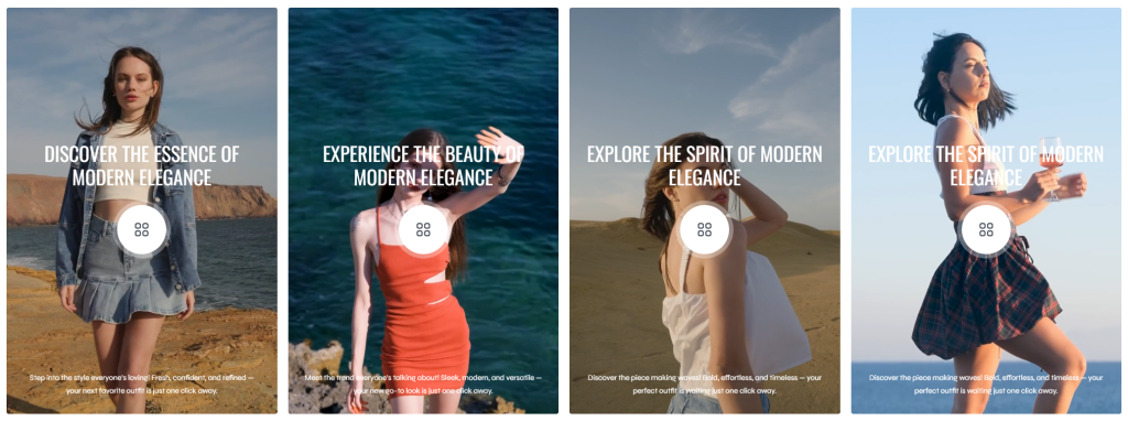
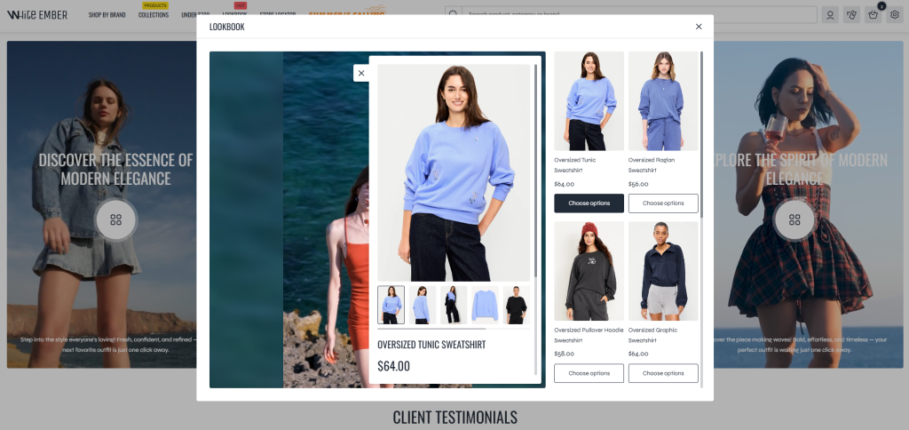
The Lookbook Popup section allows merchants to showcase products inside an interactive popup experience combined with promotional images or videos. Unlike the standard Lookbook section, this section does not use clickable product points on images. Instead, products are displayed inside a popup product list, creating a cleaner and more immersive shopping experience.
This section is especially useful for livestream replays, promotional fashion videos, campaign showcases, or product storytelling content where video engagement plays an important role in attracting customer attention. Displaying products alongside engaging media can help customers explore featured items more naturally while watching promotional content.
Settings
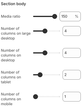
- Media ratio: Controls the aspect ratio used for the lookbook media displayed inside the section.
- Number of columns on large desktop: Defines how many product columns are displayed inside the popup on very large desktop screens.
- Number of columns on desktop: Controls the popup product grid layout on desktop devices.
- Number of columns on tablet: Adjusts the popup product layout for tablet devices.
- Number of columns on mobile: Defines the number of product columns displayed inside the popup on mobile devices.
Block: Item
Each lookbook entry inside the section is created using a Lookbook Item block.
- Media
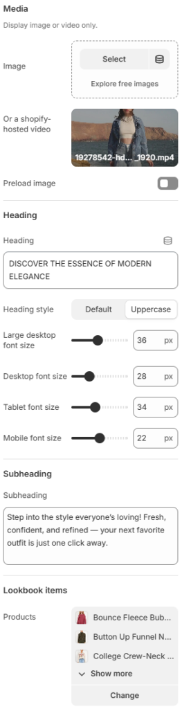
Image: Uploads the image displayed for the lookbook item.
A Shopify-hosted video: Uses a Shopify-hosted video instead of an image for the lookbook item.
Preload image: Enables image preloading to improve loading performance and visual stability. - Heading
Heading: Defines the main title displayed for the lookbook item.
Heading style: Controls the visual appearance of the heading text. Available options include Default and Uppercase.
Large desktop font size: Controls the heading font size displayed on large desktop screens.
Desktop font size: Defines the heading font size for desktop devices.
Tablet font size: Adjusts the heading font size displayed on tablet devices.
Mobile font size: Controls the heading font size displayed on mobile devices. - Subheading: Adds supporting descriptive text displayed below the heading.
- Products: Allows you to select the products displayed inside the popup product list.
Using engaging promotional videos, balanced typography, and carefully selected product lists can help create a more interactive shopping experience while increasing customer engagement with featured products and livestream content.