
Tab collection
The Tab Collection section allows merchants to display products from multiple collections inside an interactive tab layout. Customers can quickly switch between collection tabs to browse different product groups without leaving the page, creating a smoother and more engaging shopping experience.
Each collection tab is managed using a separate section block, allowing merchants to fully customize the displayed collections and tab titles.
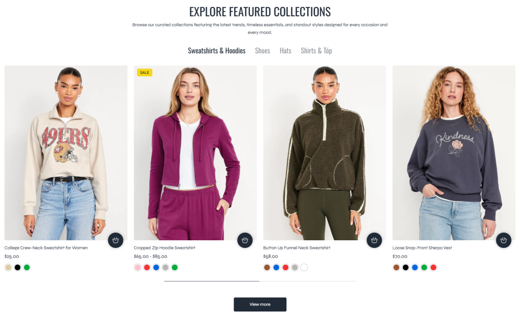
Settings
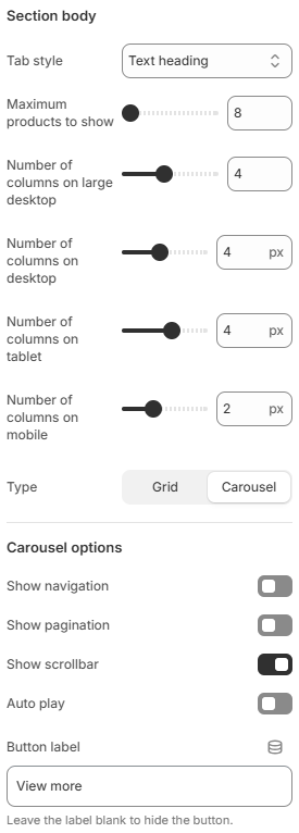
- Tab style: Controls whether the collection tabs use the typography style of heading text or regular body text.
- Maximum products to show: Limits the total number of products displayed for each collection tab.
- Number of columns on large desktop: Defines how many product columns are displayed on very large desktop screens.
- Number of columns on desktop: Controls the product grid layout displayed on desktop devices.
- Number of columns on tablet: Adjusts the product layout for tablet devices.
- Number of columns on mobile: Defines the number of product columns displayed on mobile devices.
- Type: Controls the product display layout. Available options include Grid and Carousel.
- Show navigation: Displays carousel navigation arrows.
- Show pagination: Displays pagination indicators below the carousel.
- Show scrollbar: Displays a draggable scrollbar for the carousel.
- Auto play: Automatically scrolls products inside the carousel when enabled.
- Button label: Defines the text displayed for the optional “view more” button. Leave empty to hide the button.
Block: Item
Each collection tab displayed inside the section is created using a Tab Collection block.
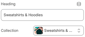
- Heading: Defines the tab title displayed inside the collection navigation.
- Collection: Selects the collection displayed for the corresponding tab.
Using clear tab labels, balanced product layouts, and properly selected featured collections can help customers browse products more efficiently while creating a cleaner and more interactive storefront experience.