
Group banner
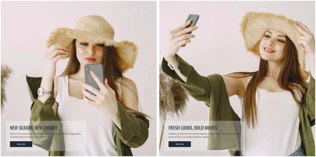
The Group Banner section allows merchants to display multiple promotional banners in a responsive grid layout. This section is ideal for highlighting featured collections, seasonal campaigns, special offers, or category navigation while maintaining a clean and visually balanced storefront design.
Each banner inside the grid is created using a section block, allowing merchants to build flexible promotional layouts with different content and media combinations.
Settings
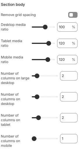
- Remove grid spacing: Removes the spacing between banner items to create a seamless grid layout.
- Desktop media ratio: Controls the media aspect ratio displayed on desktop devices.
- Tablet media ratio: Adjusts the media aspect ratio for tablet layouts.
- Mobile media ratio: Defines the media aspect ratio displayed on mobile devices.
- Number of columns on large desktop: Controls how many banner columns are displayed on very large desktop screens.
- Number of columns on desktop: Defines the number of banner columns displayed on desktop devices.
- Number of columns on tablet: Adjusts the banner grid column layout for tablet devices.
- Number of columns on mobile: Controls the number of columns displayed on mobile devices for better responsiveness.
Block: Item
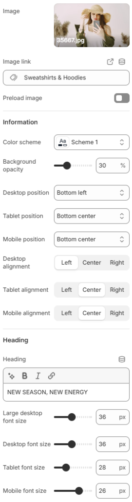
- Image: Uploads the banner image displayed inside the block.
- Image link: Defines the destination URL when customers click the banner image.
- Preload image: Enables image preloading to improve loading performance and visual stability.
- Information
Color scheme: Controls the color styling used for the banner content area.
Background opacity: Adjusts the opacity level of the content background overlay for better text readability over images.
Desktop position: Controls the content position inside the banner on desktop devices.
Tablet position: Defines the content position for tablet layouts.
Mobile position: Adjusts the content position on mobile devices.
Desktop alignment: Controls the text alignment on desktop screens.
Tablet alignment: Defines the text alignment displayed on tablet devices.
Mobile alignment: Controls the text alignment on mobile devices. - Heading
Heading: Defines the main heading text displayed inside the banner.
Large desktop font size: Controls the heading font size on large desktop screens.
Desktop font size: Defines the heading font size for desktop devices.
Tablet font size: Adjusts the heading font size displayed on tablet devices.
Mobile font size: Controls the heading font size on mobile devices for better responsiveness.
- Description
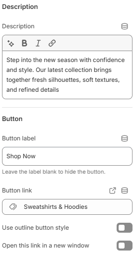
Description: Adds supporting text displayed below the heading inside the slideshow item. - Button
Button label: Defines the text displayed on the slideshow button. Leave this field empty to hide the button.
Button link: Sets the destination URL for the button.
Use outline button style: Applies an outline-style button appearance instead of a solid button style.
Open this link in a new window: Opens the button link in a new browser tab or window when enabled.
To create a more effective banner layout, it is recommended to keep promotional content simple and visually balanced. Using responsive column settings, readable text overlays, and high-quality imagery can help maintain a consistent appearance across desktop and mobile devices. Combining clear call-to-action messaging with well-positioned content areas can also improve customer interaction and make important promotions easier to notice throughout the storefront.