
Product grid
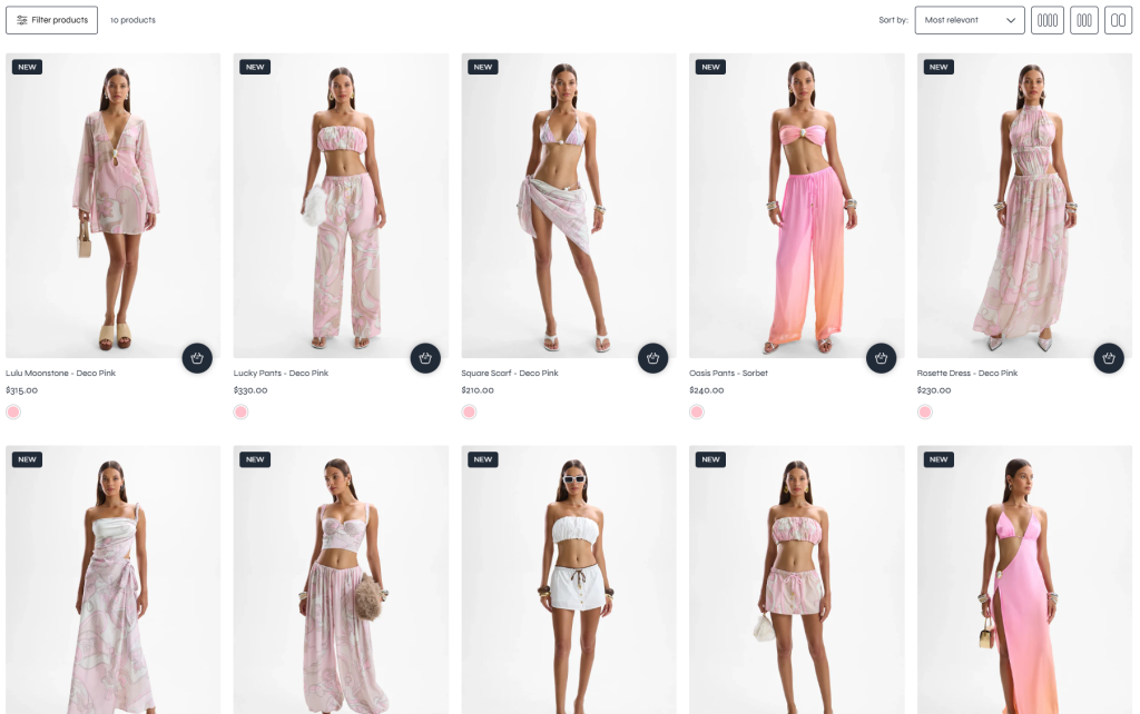
The Product Grid section displays products from a collection in a responsive grid layout with built-in pagination, filtering, and sorting functionality. This section is designed to improve product browsing experiences by allowing customers to quickly explore, filter, and organize products based on their preferences.
With flexible column layouts, customizable sidebar options, and advanced filtering controls, the section can adapt to different storefront styles while maintaining a clean and user-friendly shopping experience.
Settings
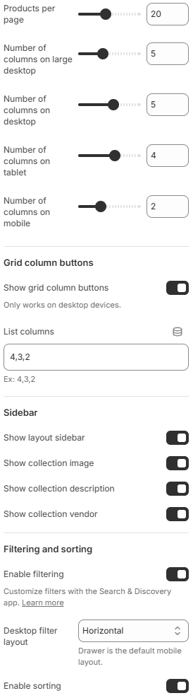
- Products per page: Controls how many products are displayed per page before pagination is applied.
- Number of columns on large desktop: Defines how many product columns are displayed on very large desktop screens.
- Number of columns on desktop: Controls the product grid column layout on desktop devices.
- Number of columns on tablet: Adjusts the product grid layout for tablet devices.
- Number of columns on mobile: Defines the number of product columns displayed on mobile devices.
- Grid column buttons
These settings allow customers to customize the number of visible product columns directly on the storefront.
Show grid column buttons: Displays grid layout buttons for changing the product column view. This feature only works on desktop devices.
List columns: Defines the list of available column layout buttons displayed to customers, such as 4, 3, or 2 columns. - Sidebar
Show layout sidebar: Displays the collection sidebar layout alongside the product grid.
Show collection image: Displays the featured image of the current collection inside the sidebar area.
Show collection vendor: Displays a list of product vendors using image-based presentation inside the sidebar area. - Filtering and sorting
Enable filtering: Enables product filtering functionality. Filters can be customized using the Shopify Search & Discovery app.
Desktop filter layout: Controls the filter display style on desktop devices. Available options include Horizontal, Vertical, and Drawer layouts.
Enable sorting: Allows customers to sort products based on available sorting criteria.
Using responsive product grids, well-organized filters, and balanced sidebar content can help improve product discoverability and create a smoother shopping experience. For the best results, use column layouts that match your product imagery and enable filtering options that help customers quickly find relevant products.