How to Reduce CLS in Shopify Stores (Detailed Technical Solutions)
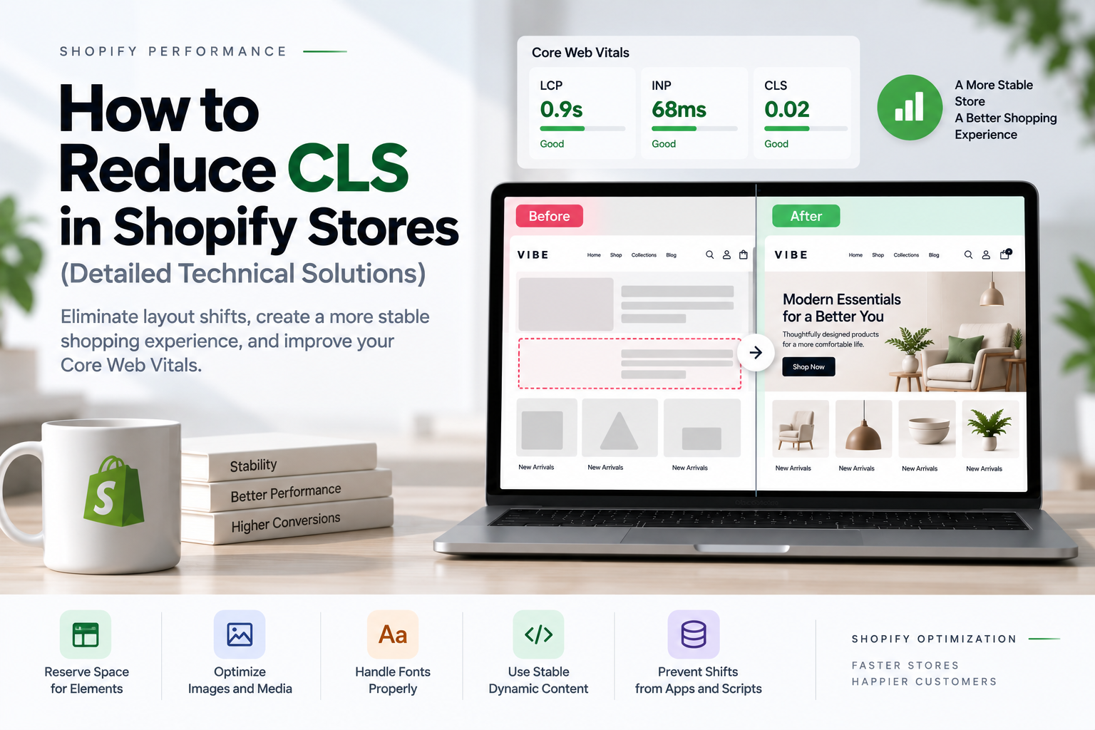
Cumulative Layout Shift (CLS) is one of the most common Core Web Vitals problems affecting Shopify stores. A storefront can load quickly and still feel slow or frustrating when product images resize, fonts change, banners appear late, or app widgets push existing content down the page. Effective Shopify CLS optimization focuses on preventing these unexpected movements before they happen.
For Shopify theme developers, reducing CLS is less about adding a single optimization and more about creating predictable layouts. Images need reserved dimensions, dynamic content needs stable containers, fonts need careful handling, and JavaScript should not unexpectedly modify the page structure after the initial render.
This guide explains how to reduce CLS in Shopify stores with practical technical solutions that can be applied directly to Shopify themes and custom storefront components.
Table of contents
- What Is CLS in Shopify?
- What Is a Good CLS Score?
- Why Shopify CLS Optimization Matters
- How CLS Works
- Common Shopify CLS Problems and Their Causes
- Shopify CLS Optimization for Images
- Use Aspect Ratio Containers
- Fix CLS in Shopify Product Galleries
- Stabilize Hero Images
- Prevent Lazy-Loaded Images From Causing CLS
- Fix Font-Related Layout Shifts
- Reduce Unnecessary Shopify Font Weights
- Prevent Announcement Bar CLS
- Fix Shopify Header Layout Shifts
- Stabilize Sticky Headers
- Prevent App Widgets From Causing CLS
- Avoid Injecting Content Above Existing Elements
- Stabilize Product Variant Information
- Prevent Product Price Layout Shifts
- Fix Add-to-Cart Layout Shifts
- Prevent Cart Drawer CLS
- Fix CLS on Shopify Collection Pages
- Prevent CLS During Collection Filtering
- Stabilize Shopify Search Results
- Avoid Late-Loading CSS
- Prevent Unstyled Custom Elements
- Avoid Layout Shifts From Popups
- Be Careful With Dynamic Height
- Avoid Unnecessary DOM Replacement
- Do Not Animate Layout Properties Unnecessarily
- Use CSS Containment Where Appropriate
- How to Find the Element Causing CLS
- Use PerformanceObserver to Debug CLS
- Lab CLS vs Real-User CLS
- A Practical Shopify CLS Optimization Workflow
- Shopify CLS Optimization Checklist
- How CLS Relates to LCP and INP
- Can a Premium Shopify Theme Have Poor CLS?
- When Custom Shopify Development Makes Sense
- Shopify CLS Optimization Should Start With the Biggest Problems
- Final Thoughts
What Is CLS in Shopify?
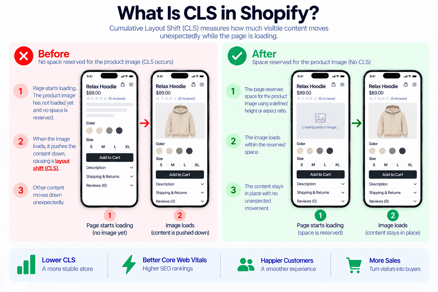
CLS stands for Cumulative Layout Shift. It measures the visual stability of a webpage by tracking unexpected movement of visible elements while the page is loading and during the user’s visit.
A layout shift happens when an element that is already visible changes its position without the user intentionally causing that change.
For example, consider a product page where the product image initially has no defined height:
<img src="product-image.jpg" alt="Product">The browser may initially render the surrounding content without knowing exactly how much space the image will require.
When the image finishes loading, its dimensions become available:
Image loads
↓
Image height is calculated
↓
Product information moves down
↓
Add to Cart button moves
The customer sees the page jump.
That movement contributes to CLS.
Common sources of CLS in Shopify include:
- Images without defined dimensions
- Product galleries without reserved space
- Lazy-loaded images
- Web fonts changing text dimensions
- Announcement bars appearing after page load
- App widgets being injected dynamically
- Reviews loading asynchronously
- Product recommendations expanding
- Variant information changing height
- Dynamic cart messages
- Search results replacing existing content
- Popups inserted into the document flow
- JavaScript replacing large sections
- Custom elements changing dimensions after initialization
What Is a Good CLS Score?
Google generally evaluates CLS using these thresholds:
| CLS Score | Performance |
|---|---|
| 0.1 or below | Good |
| 0.1 to 0.25 | Needs Improvement |
| Above 0.25 | Poor |
For a Shopify store, the practical target should be 0.1 or lower.
However, CLS should not be treated as a single number that exists independently from the user experience.
A store with a CLS score of 0.08 may still have a noticeable shift in an important location if that movement affects a product title, price, navigation item, or Add to Cart button.
This is why debugging the actual elements responsible for the shift is more useful than simply trying to lower the score.
Why Shopify CLS Optimization Matters
Shopify stores contain many dynamic components that can change during page loading.
A typical product page may include:
- Header
- Announcement bar
- Navigation
- Product gallery
- Product information
- Price
- Variant selectors
- Inventory information
- Shipping messages
- Reviews
- Subscription widgets
- Upsells
- Sticky Add to Cart
- Related products
- Recently viewed products
Every dynamic component can potentially introduce layout instability.
For ecommerce websites, this can have a direct impact on usability.
Imagine a customer is reading product information and an app suddenly inserts a promotional message above it. The entire product description moves down.
Or a customer is about to click a variant selector and the product image changes size, moving the selector away from the cursor.
The page technically works, but the interaction feels broken.
Effective Shopify CLS optimization therefore improves both Core Web Vitals and the perceived quality of the storefront.
How CLS Works
CLS is based on layout shift events.
A layout shift occurs when visible content changes position unexpectedly.
The score is influenced by two main concepts:
Impact Fraction
Impact fraction represents how much of the viewport is affected by the layout shift.
A large section moving will generally have a larger impact than a small icon moving.
Distance Fraction
Distance fraction represents how far the affected content moves relative to the viewport.
A large movement produces a larger contribution than a very small movement.
This means a large hero image changing height can create a significant CLS problem even if it happens only once.
Common Shopify CLS Problems and Their Causes
Before changing code, identify which component is causing the movement.
The most common Shopify CLS problems usually come from a relatively small group of components.
Images Without Dimensions
Images are one of the most common causes of layout shift.
If the browser does not know an image’s dimensions before it loads, it may not reserve the correct amount of space.
Dynamic Content
Content injected after the page has rendered can push existing content downward.
Examples include:
- Reviews
- App blocks
- Product recommendations
- Promotional messages
- Loyalty widgets
- Subscription components
Web Fonts
A custom font can change the size and wrapping of text after it loads.
This can change the height of headings, buttons, navigation, and product information.
JavaScript
JavaScript can cause CLS when it:
- Inserts elements
- Replaces sections
- Changes heights
- Changes widths
- Moves elements
- Initializes components with different dimensions
Third-Party Apps
Apps often load asynchronously, which means the browser may render the main page before the app content is ready.
If the app does not reserve space, the page can shift when the widget appears.
Shopify CLS Optimization for Images
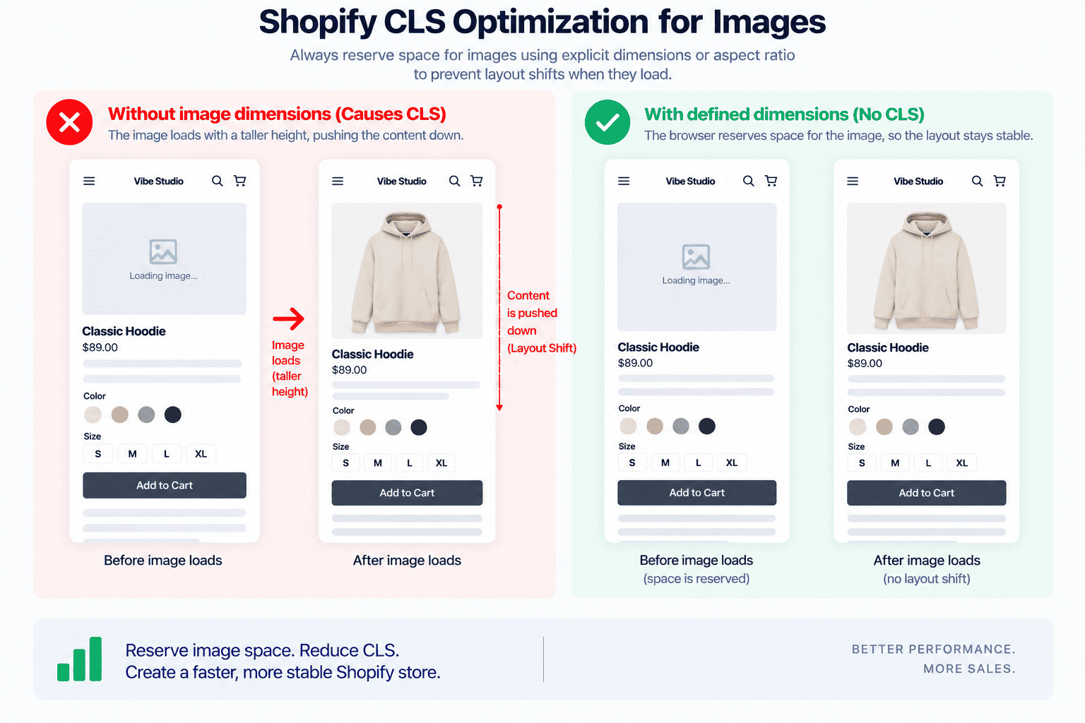
One of the most effective Shopify CLS optimization techniques is to ensure that image dimensions are known before the image loads.
Instead of:
<img src="product.jpg" alt="Product">
use dimensions:
<img
  src="product.jpg"
  width="800"
  height="1000"
  alt="Product"
>
The browser can use these dimensions to calculate the aspect ratio before the image is downloaded.
Shopify themes can access image dimensions through Liquid.
For example:
{{ product.featured_image
  | image_url: width: 1200
  | image_tag:
    width: product.featured_image.width,
    height: product.featured_image.height,
    alt: product.title
}}
The exact implementation will depend on how the theme handles responsive images, but the principle is consistent:
The browser should know the image geometry as early as possible.
Use Aspect Ratio Containers
Explicit image dimensions are useful, but responsive product grids often benefit from CSS aspect ratios.
For example:
.product-card__media {
  aspect-ratio: 4 / 5;
  overflow: hidden;
}

.product-card__media img {
  width: 100%;
  height: 100%;
  object-fit: cover;
}
The browser now knows the expected height of the image container before the image loads.
This is particularly useful for:
- Collection grids
- Search results
- Featured collections
- Related products
- Product recommendations
- Recently viewed products
Match the Actual Product Image Ratio
Do not use an arbitrary aspect ratio simply because it appears stable.
If the theme displays product images in a 1:1 ratio, use:
.product-card__media {
  aspect-ratio: 1 / 1;
}
If the design uses portrait images:
.product-card__media {
  aspect-ratio: 4 / 5;
}
The reserved ratio should match the actual visual presentation.
Fix CLS in Shopify Product Galleries
Product galleries deserve special attention because they are frequently above the fold.
A common problematic structure is:
<div class="product-gallery">
  <img src="product.jpg" alt="Product">
</div>
If the gallery container has no defined geometry, its height can change when the image loads.
A more stable implementation is:
.product-gallery {
  aspect-ratio: 1 / 1;
  position: relative;
  overflow: hidden;
}

.product-gallery img {
  width: 100%;
  height: 100%;
  object-fit: cover;
}
If your Shopify theme supports configurable image ratios, use modifier classes.
.product-gallery--square {
  aspect-ratio: 1 / 1;
}

.product-gallery--portrait {
  aspect-ratio: 4 / 5;
}

.product-gallery--landscape {
  aspect-ratio: 4 / 3;
}
This allows the layout to remain stable while different images load.
Stabilize Hero Images
Hero sections are another major source of CLS.
A hero image should establish its height before the actual image finishes loading.
For example:
.hero {
  aspect-ratio: 16 / 7;
  overflow: hidden;
}
For a responsive hero, you may instead use breakpoint-specific dimensions:
.hero {
  min-height: 500px;
}

@media (max-width: 749px) {
  .hero {
    min-height: 420px;
  }
}
The correct implementation depends on the design.
The important point is that the browser should not have to discover the final section height after the image arrives.
Prevent Lazy-Loaded Images From Causing CLS
Lazy loading is useful for performance, but it should not mean lazy layout definition.
This implementation can be problematic:
<div class="image-wrapper">
  <img loading="lazy" src="product.jpg">
</div>
if .image-wrapper has no height or aspect ratio.
When the image loads, the wrapper expands.
Instead:
.image-wrapper {
  aspect-ratio: 4 / 5;
}
Lazy loading should delay the network request.
It should not delay the browser’s understanding of the layout.
Fix Font-Related Layout Shifts
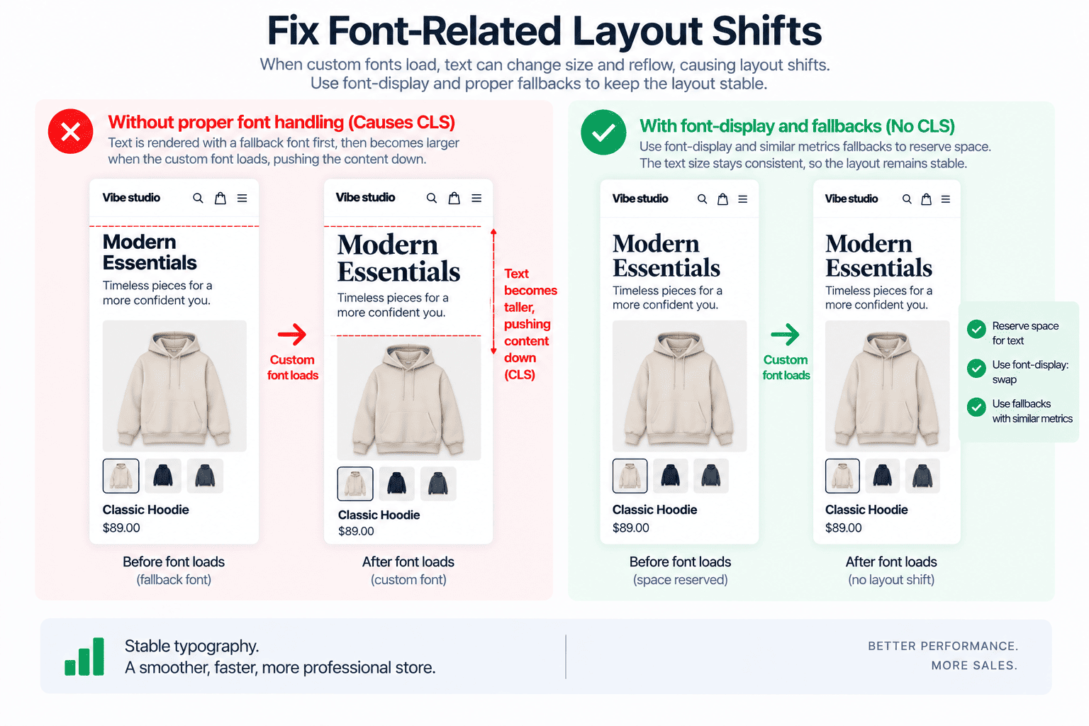
Fonts are another common source of CLS.
A typical sequence is:
Fallback font
↓
Custom font downloads
↓
Text metrics change
↓
Line wrapping changes
↓
Element height changes
↓
Content moves
This is particularly noticeable with:
- Large headings
- Product titles
- Navigation
- Announcement bars
- Buttons
- Product descriptions
Use Font Display Carefully
A typical font declaration might be:
@font-face {
  font-family: "ThemeFont";
  src: url("theme-font.woff2") format("woff2");
  font-display: swap;
}
font-display: swap allows text to remain visible while the custom font loads.
However, swap alone does not guarantee zero CLS.
If the fallback font has very different metrics from the final font, the text can still reflow.
Choose a Compatible Fallback Font
For example:
body {
  font-family: "ThemeFont", Arial, sans-serif;
}
The fallback should ideally have similar:
- Character width
- Line height
- Weight appearance
- Overall text metrics
For theme developers, font selection should therefore consider performance as well as visual appearance.
Reduce Unnecessary Shopify Font Weights
A theme should not load every font weight just because the theme settings support them.
If the storefront uses:
400
500
700
there may be little reason to load:
100
200
300
600
800
900
unless they are genuinely used.
Loading fewer font files reduces network work and makes typography more predictable.
A configurable Shopify theme should ideally load only the font weights selected by the merchant.
Prevent Announcement Bar CLS
Announcement bars are a classic source of layout shift.
A problematic implementation might work like this:
Page renders
↓
Header appears
↓
JavaScript initializes
↓
Announcement bar appears
↓
Header moves downward
Everything below the announcement bar shifts.
Whenever possible, render the announcement bar directly through Liquid.
{% if section.settings.show_announcement %}
  <div class="announcement-bar">
    {{ section.settings.text }}
  </div>
{% endif %}
The element exists from the beginning rather than being injected later.
Stabilize Rotating Announcement Bars
If the announcement bar rotates between multiple messages, reserve enough space for the expected content.
For example:
.announcement-bar {
  min-height: 40px;
  display: flex;
  align-items: center;
}
If the text can wrap on mobile, make sure the layout accounts for multiple lines.
A desktop height should not automatically be assumed to work on mobile.
Fix Shopify Header Layout Shifts
The header is particularly important because it appears on almost every page.
Potential CLS sources include:
- Logo
- Navigation
- Announcement bar
- Search
- Account icons
- Cart counter
- Country selector
- Language selector
- Mobile menu
Reserve Logo Dimensions
Instead of:
<img src="logo.svg" alt="Brand">
use predictable dimensions:
<img
  src="logo.svg"
  width="160"
  height="40"
  alt="Brand"
>
The dimensions should match the actual logo ratio.
Keep Header Height Predictable
Avoid JavaScript that changes the header’s document-flow height immediately after loading.
For example, avoid unnecessarily switching between:
height: 90px;
and:
height: 64px;
after initialization if doing so causes the content below to move.
If a compact header is required, consider using visual transformations or carefully designed sticky behavior that preserves the surrounding layout.
Stabilize Sticky Headers
Sticky headers can create layout instability when their height or position changes dynamically.
A simple implementation is:
.site-header {
  position: sticky;
  top: 0;
  z-index: 100;
}
The header should retain predictable dimensions while scrolling.
If the header changes from large to compact, test whether the transition changes document flow.
Also be careful when using:
body {
  overflow: hidden;
}
for menus and drawers.
Changing scrollbar behavior can alter the viewport width and cause horizontal movement in some layouts.
Prevent App Widgets From Causing CLS
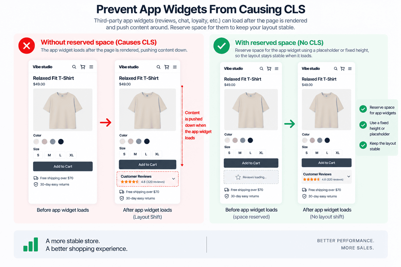
Third-party apps are one of the most important areas to investigate when performing Shopify CLS optimization.
Apps can add content such as:
- Reviews
- Loyalty programs
- Subscription widgets
- Product badges
- Upsells
- Social proof
- Shipping calculators
- Size guides
- Chat widgets
The problem is not necessarily the app itself.
The problem is often that the page does not reserve space for the app before the widget loads.
Consider:
<div class="reviews-widget"></div>
If the initial element has zero height, the page may collapse around it.
When the widget loads, it expands.
That expansion pushes everything below it.
Reserve Widget Space
For example:
.reviews-widget {
  min-height: 120px;
}
Or:
.product-reviews {
  min-height: 160px;
}
The value should be based on the actual widget.
Do not blindly use large fixed heights because excessive empty space creates a different usability problem.
Avoid Injecting Content Above Existing Elements
One of the most damaging JavaScript patterns is inserting new content into an area that has already rendered.
For example:
document
  .querySelector('.product-information')
  .insertAdjacentHTML(
    'afterbegin',
    '<div class="promo">Special Offer</div>'
  );
The product information moves downward.
If the promotion can be known when the page is rendered, prefer Liquid:
{% if section.settings.show_promo %}
  <div class="product-promo">
    {{ section.settings.promo_text }}
  </div>
{% endif %}
Server-rendered content makes the initial layout much easier to predict.
Stabilize Product Variant Information
Variant selection can introduce CLS when changing a product variant modifies the height of the product information area.
For example, selecting a variant may change:
- Price
- Compare-at price
- Availability
- SKU
- Inventory message
- Subscription information
- Shipping information
If these elements appear and disappear, everything below them can move.
Reserve Space for Dynamic Messages
Instead of:
.variant-message {
  display: none;
}
and later changing it to:
.variant-message {
  display: block;
}
create a stable message region:
.variant-message-container {
  min-height: 24px;
}
Then update the content inside the region.
The surrounding product layout remains more stable.
Update Only What Changes
Avoid replacing the entire product information component when only the price has changed.
Instead of:
productInformation.innerHTML = newMarkup;
update individual elements:
priceElement.textContent = variant.price;
availabilityElement.textContent =
  variant.available ? 'In stock' : 'Sold out';
This approach can improve both CLS and interaction performance.
Prevent Product Price Layout Shifts
Prices can change from:
$79
to:
$59 $79
when a discounted variant is selected.
If the price container is not designed for both states, its dimensions can change.
A stable container can help:
.product-price {
  min-height: 28px;
  display: flex;
  align-items: center;
  gap: 8px;
}
The exact height should match the theme’s typography.
Also test:
- Long prices
- Different currencies
- Sale prices
- Compare-at prices
- Mobile layouts
Currency changes can produce significantly different text widths.
Fix Add-to-Cart Layout Shifts
The Add to Cart area often contains dynamic messages.
Examples include:
- Added to cart
- Sold out
- Inventory warnings
- Quantity limits
- Shipping messages
Instead of inserting these messages unpredictably, create a dedicated region:
<div
  class="add-to-cart-message"
  aria-live="polite"
></div>
Then reserve a small amount of space:
.add-to-cart-message {
  min-height: 24px;
}
The message can change without pushing the entire form around.
Prevent Cart Drawer CLS
A cart drawer should normally be positioned independently from the document flow.
For example:
.cart-drawer {
  position: fixed;
  inset: 0 0 0 auto;
  width: min(420px, 100%);
}
The drawer can appear above the page instead of pushing the page content.
Also consider scrollbar behavior.
When a drawer opens, many themes lock body scrolling:
body.is-cart-open {
  overflow: hidden;
}
Depending on the browser and layout, removing the scrollbar can change the available viewport width.
A robust cart drawer implementation should account for this so that the underlying page does not visibly shift.
Fix CLS on Shopify Collection Pages
Collection pages are particularly sensitive to image sizing because one page can contain dozens of product cards.
A single unstable product card may be minor.
Twenty-four unstable cards can create a much larger visual problem.
Use stable media containers:
.product-card__media {
  aspect-ratio: 3 / 4;
  overflow: hidden;
}

.product-card__media img {
  width: 100%;
  height: 100%;
  object-fit: cover;
}
Stabilize Product Card Titles
Product titles can have different lengths.
One card may contain:
Classic Cotton Shirt
while another contains:
Oversized Organic Cotton Relaxed Fit Shirt
This creates different card heights.
Depending on the design, you can reserve a predictable title area:
.product-card__title {
  min-height: 3em;
}
Or limit titles to two lines:
.product-card__title {
  display: -webkit-box;
  -webkit-box-orient: vertical;
  -webkit-line-clamp: 2;
  overflow: hidden;
}
Test this carefully with different languages and screen sizes.
Prevent CLS During Collection Filtering
Collection filtering can create layout shifts when the entire product grid is removed and recreated.
A problematic flow might look like:
Filter selected
↓
Grid disappears
↓
Loading indicator appears
↓
New products arrive
↓
Grid reappears
The page can change height dramatically.
A better experience is often to keep the existing grid structure while new results are being fetched.
For example:
.collection-grid.is-loading {
  opacity: 0.6;
  pointer-events: none;
}
The existing layout remains in place while the results update.
For more complex implementations, reserve the expected grid structure before replacing the content.
Stabilize Shopify Search Results
Predictive search can also create layout instability.
If the search dropdown changes height as results arrive, it can move nearby elements.
The search container should have a predictable position, and the results panel should ideally be positioned independently from the surrounding document flow.
For example:
.predictive-search {
  position: absolute;
  top: 100%;
  left: 0;
  right: 0;
}
This allows the result panel to expand without pushing the rest of the page downward.
Avoid Late-Loading CSS
CSS can cause CLS when the initial page renders without the styles needed to establish the final layout.
For example:
HTML renders
↓
Basic layout appears
↓
Stylesheet loads
↓
Grid changes
↓
Typography changes
↓
Spacing changes
↓
Page shifts
Critical layout CSS should be available early enough to establish:
- Header geometry
- Hero dimensions
- Product gallery
- Product grid
- Typography
- Announcement bar
- Navigation
A fast stylesheet that arrives too late can still create a poor visual experience.
Prevent Unstyled Custom Elements
Custom elements are powerful for Shopify theme development, but they can cause layout instability if they render in an incomplete state.
Consider:
<product-gallery>
  ...
</product-gallery>
The browser may initially display the children using their default flow.
Then JavaScript initializes the gallery:
Initial vertical layout
↓
JavaScript loads
↓
Carousel initializes
↓
Dimensions change
The result can be a visible shift.
Establish the component’s basic geometry with CSS before initialization.
For example:
product-gallery {
  display: block;
  min-height: 500px;
}
For more complex components, use a controlled ready state:
product-gallery:not(.is-ready) {
  min-height: 500px;
}
The reserved height should reflect the actual component.
Avoid Layout Shifts From Popups
Popups should generally be outside normal document flow.
Examples include:
- Newsletter popups
- Cookie notices
- Promotional banners
- Quick view dialogs
- Size guides
- Chat widgets
Use fixed or absolute positioning where appropriate:
.newsletter-popup {
  position: fixed;
  right: 20px;
  bottom: 20px;
}
The popup should overlay the page rather than push the content downward.
This distinction is important:
Normal flow
→ affects surrounding layout

Overlay
→ does not move surrounding layout
Be Careful With Dynamic Height
Changing an element’s height after page load is one of the simplest ways to create CLS.
For example:
element.style.height = 'auto';
after the content arrives can cause the element to expand.
If the final size is known, reserve it earlier.
If the final size is unknown, consider whether the content can be rendered in a container with predictable constraints.
Avoid Unnecessary DOM Replacement
Large DOM replacements can create unexpected visual changes.
For example:
container.innerHTML = newHTML;
can replace:
- Images
- Product information
- Buttons
- Prices
- Messages
- App blocks
Even if the replacement appears visually similar, small differences in content dimensions can shift the page.
Whenever possible, update the smallest required DOM node.
Instead of:
productSection.innerHTML = html;
prefer targeted updates:
priceElement.innerHTML = priceMarkup;
or:
availabilityElement.textContent = message;
The less of the layout you replace, the fewer opportunities there are for unexpected movement.
Do Not Animate Layout Properties Unnecessarily
Animations can also make layout shifts harder to diagnose.
Be careful with transitions involving:
height
width
margin
padding
top
left
when the element affects surrounding document flow.
For visual movement, transforms are often more appropriate:
.element {
  transform: translateY(10px);
  opacity: 0;
}
However, transforms should not be used as a blanket solution.
If the underlying layout is unstable, an animation may simply hide the problem temporarily.
The correct goal is predictable geometry.
Use CSS Containment Where Appropriate
CSS containment can help isolate layout calculations for suitable components.
For example:
.product-card {
  contain: layout;
}
can help prevent layout effects from propagating outside a component.
However, containment should be used carefully.
It is not a universal CLS fix.
Test components that depend on:
- Overflow
- Absolute positioning
- Size calculations
- Parent dimensions
- Child-to-parent layout relationships
Performance-related CSS should be based on measured behavior rather than applied indiscriminately.
How to Find the Element Causing CLS
A CLS score tells you that a problem exists.
It does not necessarily tell you what caused it.
For technical debugging, use:
- Chrome DevTools
- Lighthouse
- PageSpeed Insights
- Google Search Console
- Chrome UX Report
- Real-user monitoring
In Chrome DevTools, open the Performance panel and record a page load.
Look for layout shift events.
Inspect the affected nodes to determine which elements moved.
This changes the optimization process from:
CLS = 0.24
↓
Try random CSS changes
to:
CLS = 0.24
↓
Product image moved 320px
↓
Image container had no reserved ratio
↓
Add aspect-ratio
↓
Test again
The second approach is significantly more effective.
Use PerformanceObserver to Debug CLS
Shopify theme developers can also use the Layout Instability API during development.
For example:
let clsValue = 0;

const observer = new PerformanceObserver((list) => {
  for (const entry of list.getEntries()) {
    if (!entry.hadRecentInput) {
      clsValue += entry.value;

      console.log('CLS:', clsValue);
      console.log('Layout shift:', entry);
    }
  }
});

observer.observe({
  type: 'layout-shift',
  buffered: true
});
For deeper investigation, inspect the available layout shift sources:
entry.sources
This can help identify the DOM elements associated with the shift.
This type of code should be used as a development diagnostic, not permanently shipped as unnecessary production JavaScript.
Lab CLS vs Real-User CLS
A Shopify store can have a good Lighthouse CLS score and still experience layout instability for real users.
Laboratory testing uses controlled conditions.
Real users have:
- Different devices
- Different screen sizes
- Different network conditions
- Different browser states
- Different cached resources
- Different interaction patterns
A theme that behaves perfectly on a desktop development machine may behave differently on a slower mobile device.
This is why real-user Core Web Vitals data is important for production Shopify stores.
A Practical Shopify CLS Optimization Workflow
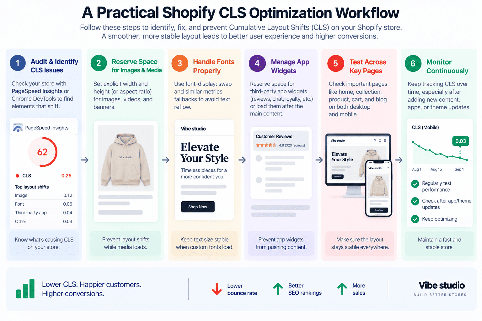
A structured Shopify CLS optimization workflow is more effective than changing random CSS based on guesswork.
Step 1: Measure
Start with:
- Lighthouse
- PageSpeed Insights
- Chrome DevTools
- Search Console Core Web Vitals
Record the current CLS.
Step 2: Identify the Shift
Find the actual element or section that moves.
Do not stop at the score.
Step 3: Determine the Trigger
Ask:
Why did this element not have its final geometry from the beginning?
Typical answers include:
- Image dimensions were unknown
- Font metrics changed
- JavaScript inserted content
- App widget loaded late
- CSS loaded late
- Product data changed
- Section was replaced
Step 4: Reserve Space
Use the appropriate mechanism:
aspect-ratio
or:
min-height
or explicit:
width
height
The choice depends on the component.
Step 5: Reduce Dynamic Rendering
If the content can be rendered through Liquid, avoid unnecessarily recreating it with JavaScript.
Prefer:
Liquid
↓
Stable HTML
↓
CSS
when possible.
Instead of:
HTML shell
↓
JavaScript
↓
Fetch
↓
DOM replacement
Step 6: Audit Apps
Disable or isolate third-party apps where practical.
Compare the page behavior before and after.
If the CLS improves significantly, investigate the app widget responsible.
Step 7: Test Mobile
Test at mobile breakpoints and on slower connections.
Pay particular attention to:
- Header
- Product gallery
- Product information
- Product grid
- Announcement bar
- Reviews
- Sticky components
Step 8: Validate Real-User Data
After deployment, review field data.
The goal is not to achieve a perfect synthetic score.
The goal is to create a stable experience for actual shoppers.
Shopify CLS Optimization Checklist
Use this checklist when auditing a Shopify theme.
Images
- Images have predictable dimensions
- Product images use stable aspect ratios
- Hero images reserve their space
- Lazy-loaded images do not collapse containers
- Product cards maintain stable media dimensions
Fonts
- Only required font weights are loaded
- Fallback fonts are compatible
- Typography does not dramatically change after font loading
- Critical fonts are loaded appropriately
Dynamic Content
- App widgets reserve space
- Reviews have stable containers
- Recommendations do not unexpectedly expand sections
- Variant messages use predictable regions
- Announcement bars have stable dimensions
JavaScript
- JavaScript does not inject content above existing content
- Large sections are not unnecessarily replaced
- Variant updates are targeted
- Search results do not cause unnecessary document movement
- Custom elements have stable initial geometry
CSS
- Critical layout CSS loads early
- Header dimensions are predictable
- Product grids have stable image areas
- Popups are removed from normal document flow
- Layout animations are used carefully
Validation
- Lighthouse tested
- PageSpeed Insights tested
- Chrome DevTools inspected
- Mobile tested
- Real-user data reviewed
How CLS Relates to LCP and INP
CLS is only one part of the Core Web Vitals picture.
A Shopify store should consider three major user-experience metrics:
LCP
Largest Contentful Paint measures how quickly the main content becomes visible.
Common Shopify LCP elements include:
- Hero images
- Product images
- Large headings
- Promotional banners
INP
Interaction to Next Paint measures how responsive the page is when users interact with it.
Common Shopify interactions include:
- Variant selection
- Add to Cart
- Search
- Filtering
- Cart drawer
- Navigation
CLS
Cumulative Layout Shift measures visual stability.
The three metrics answer different questions:
LCP
How quickly does the main content appear?

INP
How quickly does the page respond?

CLS
Does the page stay stable?
A strong Shopify theme needs all three.
For interaction performance, see our guide to Shopify INP optimization.
Can a Premium Shopify Theme Have Poor CLS?
Yes.
A premium Shopify theme can still have poor CLS.
The word “premium” does not guarantee technical performance.
Feature-rich themes often include:
- More sections
- More animations
- More dynamic components
- More integrations
- More configurable settings
- More JavaScript
- More third-party functionality
Every additional component introduces another opportunity for layout instability.
The important question is not whether a theme is free or premium.
The important question is whether its architecture creates predictable layouts.
If you are evaluating theme architecture, our guide to premium Shopify themes covers the features and technical considerations worth looking at.
When Custom Shopify Development Makes Sense
Sometimes persistent CLS problems cannot be solved effectively with small CSS adjustments.
Custom Shopify development can make sense when:
- A theme relies heavily on dynamic rendering
- App integrations repeatedly create layout shifts
- Product components have become overly complex
- Large DOM sections are replaced during interactions
- Legacy theme code creates unpredictable rendering
- Performance requirements are particularly strict
In these situations, rebuilding the affected component can be more effective than adding another optimization patch.
A custom implementation can establish the correct geometry from the beginning and reduce unnecessary client-side work.
For more information, see our guide to Custom Shopify Development.
Shopify CLS Optimization Should Start With the Biggest Problems
You do not need to rewrite an entire Shopify theme to improve CLS.
Start with the elements that move the most.
In many Shopify stores, the biggest improvements come from:
- Reserving image dimensions
- Stabilizing product galleries
- Fixing header and announcement bar shifts
- Reserving space for app widgets
- Stabilizing fonts
- Preventing dynamic content from entering the document flow
- Making variant updates more predictable
- Stabilizing collection grids
- Reducing unnecessary DOM replacement
- Testing real-user performance
The most effective CLS optimization is usually architectural.
Instead of asking:
How can I hide this layout shift?
ask:
Why did the browser not know this layout was coming?
If the browser knows the expected geometry before content arrives, many CLS problems disappear naturally.
Final Thoughts
Reducing CLS in Shopify stores requires more than adding a few CSS rules. The strongest approach is to build predictable layouts from the beginning, reserve space for asynchronous content, control image and font dimensions, and avoid unnecessary changes to the document flow.
For Shopify theme developers, visual stability should be treated as part of component architecture rather than something added at the end of a performance audit.
If your Shopify store has a high CLS score or inconsistent Core Web Vitals, Vibe Studio can help identify the elements causing layout shifts and optimize the theme at the code level. If you need professional Shopify speed optimization, our team can help identify performance bottlenecks and improve your store’s overall performance.