Hero banner
The Hero Banner section is designed to create large promotional banner areas for showcasing campaigns, featured collections, product launches, or brand storytelling content. This section combines media, flexible content positioning, and an interactive featured products popup to create a visually engaging storefront experience.
The section supports both image and Shopify-hosted video media, responsive layouts, customizable content positioning, and popup product recommendations directly inside the hero area.
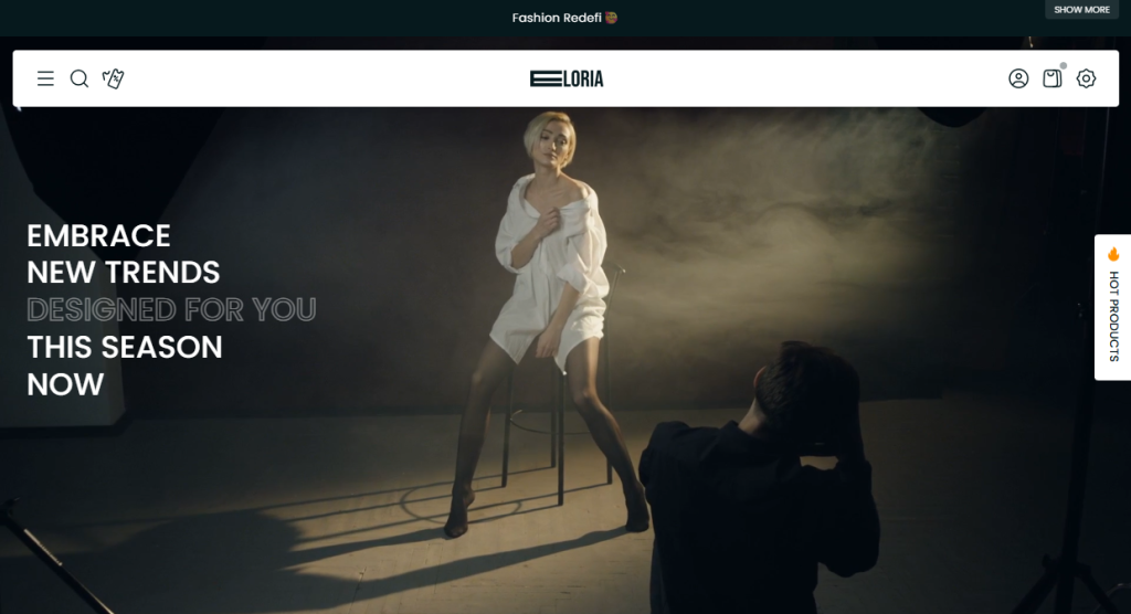
Settings
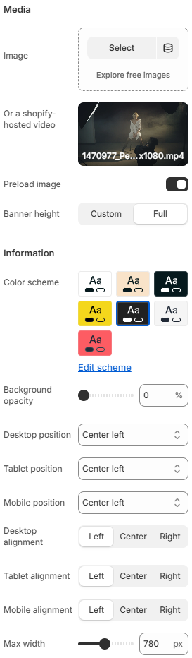
Media
- Image: Select an image to use as the hero banner background.
- Or a Shopify-hosted video: Select a Shopify-hosted video to use as the hero banner media instead of an image.
- Preload image: Enable or disable image preloading to prioritize loading the hero banner image.
- Banner height: Choose the hero banner height between a custom height and full viewport height.
Information
- Color scheme: Select the color scheme used for the hero banner content, including text and other elements.
- Background opacity: Adjust the opacity of the background overlay applied to the hero banner media.
- Desktop position: Set the position of the hero banner content on desktop screens.
- Tablet position: Set the position of the hero banner content on tablet devices.
- Mobile position: Set the position of the hero banner content on mobile devices.
- Desktop alignment: Set the horizontal alignment of the hero banner content on desktop screens.
- Tablet alignment: Set the horizontal alignment of the hero banner content on tablet devices.
- Mobile alignment: Set the horizontal alignment of the hero banner content on mobile devices.
- Max width: Set the maximum width of the hero banner content area.
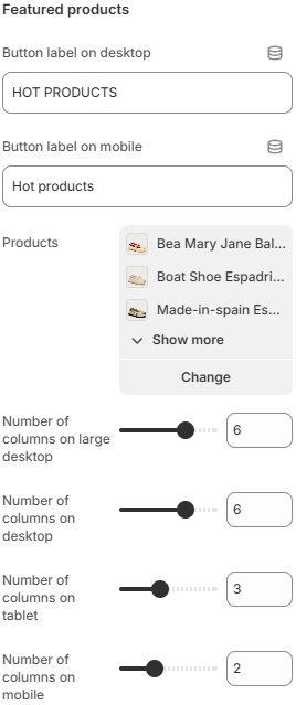
- Button label on desktop: Defines the popup trigger button label displayed on desktop devices.
- Button label on mobile: Defines the popup trigger button label displayed on mobile devices.
- Products: Allows you to select the products displayed inside the featured products popup.
- Number of columns on large desktop: Controls how many product columns are displayed inside the popup on very large desktop screens.
- Number of columns on desktop: Defines the product grid layout displayed inside the popup on desktop devices.
- Number of columns on tablet: Adjusts the popup product layout for tablet devices.
- Number of columns on mobile: Controls the number of product columns displayed inside the popup on mobile devices.
The Featured Products area displays selected products inside an interactive popup layout directly from the hero banner.
The Information area inside the Hero Banner section supports flexible content blocks such as Heading, Text, Buttons, and Spacing blocks.
Block: Heading
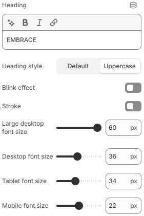
- Heading: Add and format the hero banner heading text.
- Heading style: Choose the text transformation style for the heading, such as Default or Uppercase.
- Blink effect: Enable or disable a blinking animation effect for the heading.
- Stroke: Enable or disable a stroke/outline effect around the heading text.
- Large desktop font size: Set the heading font size on large desktop screens.
- Desktop font size: Set the heading font size on desktop screens.
- Tablet font size: Set the heading font size on tablet devices.
- Mobile font size: Set the heading font size on mobile devices.
Block: Text
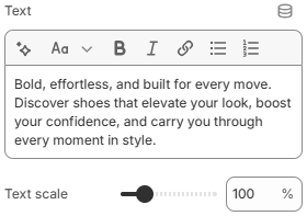
- Text: Defines the descriptive or promotional text content displayed inside the block.
- Text scale: Controls the overall text size and visual emphasis.
Block: Buttons
The Buttons block allows merchants to display up to two call-to-action buttons inside the section. Both buttons share the same configuration settings.
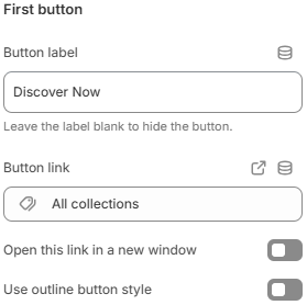
- Button label: Defines the text displayed on the button. Leave empty to hide the button.
- Button link: Sets the destination URL for the button.
- Open this link in a new window: Opens the button link in a new browser tab or window when enabled.
- Use outline button style: Applies an outline-style appearance instead of a solid button style.
Block: Spacing
The Spacing block allows merchants to add adjustable spacing between content blocks inside the section for cleaner and more flexible layouts.
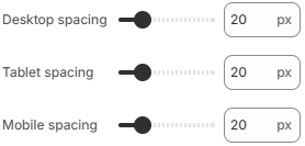
- Desktop spacing: Controls the spacing size displayed on desktop devices.
- Tablet spacing: Adjusts the spacing size for tablet layouts.
- Mobile spacing: Defines the spacing size displayed on mobile devices.
Using high-quality visuals, balanced content positioning, and carefully selected featured products can help create a stronger promotional impact while encouraging customers to explore highlighted products directly from the hero banner experience.