
1. Overview
2. Featured
3. How to install
4. Settings
4.1 Logo
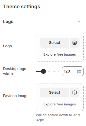
The Logo settings in Shopify let you upload and customize your store’s main logo and favicon. You can adjust logo size, placement, and alignment, while the favicon ensures your brand is instantly recognizable in browser tabs and bookmarks.
- Logo: Configuration to select a logo image.
- Desktop logo width: Adjust the width of your store’s logo for the best fit on your website.
- Favicon image: Configuration to select a favicon image.
4.2 Colors
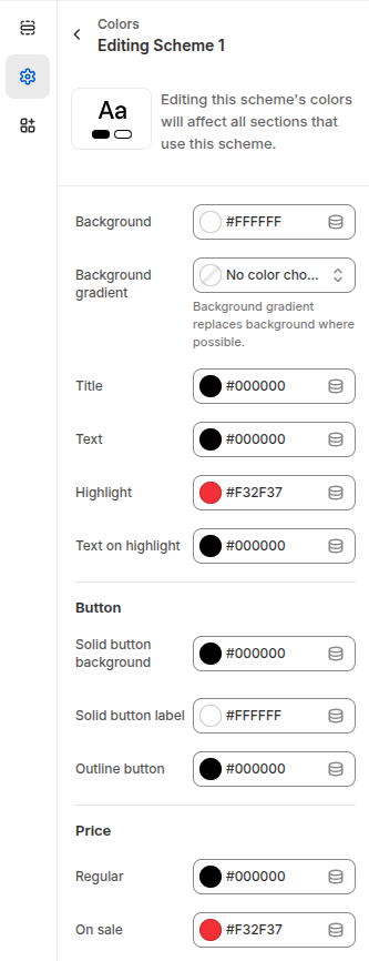
The Color Scheme settings in Shopify let you customize the look and feel of your store by defining consistent colors across sections. You can set the background, gradient, titles, text, and highlights to match your brand identity. Button styles are adjustable with options for solid or outlined designs, while price settings allow you to differentiate between regular and sale items. These configurations ensure your store’s design remains cohesive, professional, and visually appealing across all pages.
- Background: The Background setting in Shopify’s Color Scheme allows you to choose a solid color or apply a gradient as the backdrop for your store sections.
- Title: Configuration for elements defined as titles.
- Text: Configuration for text or certain other elements.
- Highlight: Configuration for certain special elements.
- Text on highlight: Configuration for elements placed on top of special elements.
Button
- Solid button background: Background color configuration for buttons.
- Solid button label: Text color configuration for buttons.
- Outline button: Color configuration for outline-style buttons.
Price
- Regular: Color configuration for default prices.
- On sale: Color configuration for sale prices.
4.3 Typography
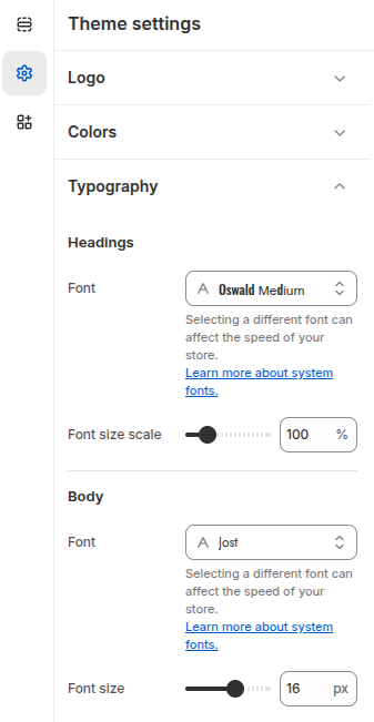
The Typography settings let you customize your store’s fonts for headings and body text. Choose from Shopify’s font library and adjust sizes to create a clear, consistent, and branded look.
Headings
- Font: Select a heading font from Shopify’s font library (system fonts and Google Fonts).
- Font size scale: Adjust the overall size scale of heading text (%) to increase or decrease all headings consistently.
Body
- Font: Choose a body text font from Shopify’s font library to ensure readability and brand consistency.
- Font size: Set the body text size (px) for optimal legibility across your store.
4.4 Layout
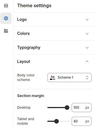
The Layout settings provide global configuration for your store’s sections.
Body color scheme: Defines the color scheme for the store’s body, controlling background and text colors.
Section margin (Desktop) – Adjusts the spacing between sections when viewed on desktop devices.
Section margin (Tablet and mobile) – Adjusts the spacing between sections on tablets and mobile devices, ensuring a balanced look across smaller screens.
These are global defaults, but individual sections can override them if needed.
4.5 Animations
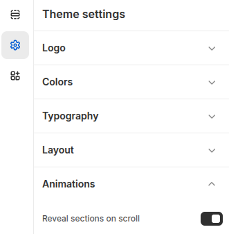
The Animations settings control how sections appear as customers browse your store.
Reveal sections on scroll: When enabled, sections are gradually revealed as the customer scrolls down the page, adding a smooth and modern visual effect
This setting helps enhance the browsing experience by making the store feel more dynamic and engaging.
4.6 Buttons
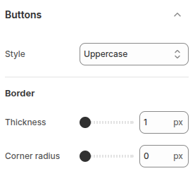
The Button settings allow you to customize the appearance of buttons across your store.
- Style: Controls how button text is displayed. Options include Default, Capitalize, and Uppercase.
- Border thickness: Sets the width of the button border when using outline-style buttons.
- Corner radius – Adjusts the roundness of button corners, from sharp square edges (0px) to fully rounded shapes.
These settings help you align button styles with your brand’s visual identity and improve the overall user experience.
4.7 Inputs
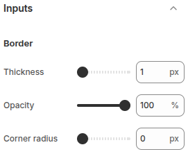
The Input settings let you customize the appearance of form fields such as text boxes and multi-line text
- Border thickness: Controls the width of the input field borders (px).
- Opacity: Adjusts the transparency level of the input borders (%), from fully solid to partially
- Corner radius: Sets the roundness of input field corners, from sharp edges (0 px) to fully rounded styles.
These settings help you match form elements to your store’s overall design style and improve visual consistency.
4.8 Product cards
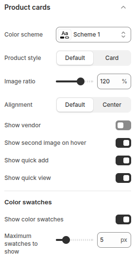
The Product cards settings allow you to customize how products are displayed
- Color scheme: Select the color scheme applied to product cards for consistent styling.
- Product style: Choose between Default or Card layout to control the card’s appearance.
- Image ratio: Adjust the product image ratio (%) to control how images are cropped and displayed.
- Alignment: Set product information alignment (Default or Center).
- Show vendor: Toggle to display or hide the product vendor/brand.
- Show second image on hover: Enable to display the product’s secondary image when customers hover over the product.
- Show quick add: Add an “Add to cart” button directly on the product card for faster shopping.
- Show quick view: Enable a pop-up quick view option so customers can see product details without leaving the page.
- Show color swatches: Display product color variants as swatches on the product.
- Maximum swatches to show: Limit the number of color swatches displayed
4.9 Quick view
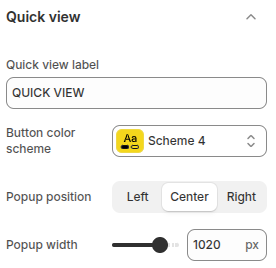
Quick view allows customers to preview product details without navigating to the product page
- Quick view label: Set the text label for the quick view button.
- Button color scheme: Choose the color scheme for the quick view button to match your theme design.
- Popup position: Define where the quick view popup appears on the screen: Left, Center, or Right.
- Popup width – Adjust the width of the quick view popup (px).
4.10 Dropdowns and pop-ups
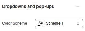
Dropdowns and pop-ups allow you to configure the appearance of dropdown menus and popup elements across the website.
- Color scheme: Select a predefined color scheme to apply consistent styling to dropdown menus and pop-up windows, ensuring they align with the overall store design.
4.11 Badges
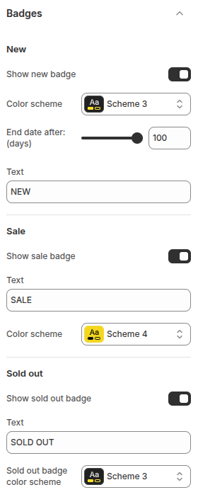
The Badges settings allow you to configure product labels such as New, Sale, and Sold out, helping highlight product status and promotions on product cards.
New Badge
- Show new badge: Toggle on/off to display a “New” badge on recently added products.
- Color scheme: Choose a color scheme for the badge to match your store design.
- End date after (days): Define how many days after publishing a product should be marked as “New.”
- Text: Customize the label text (default: NEW).
Sale Badge
- Show sale badge: Toggle on/off to display a “Sale” badge on discounted products.
- Text: Customize the label text (default: SALE).
- Color scheme: Choose a color scheme for the sale badge.
Sold Out Badge
- Show sold out badge: Toggle on/off to display a “Sold out” badge on unavailable products.
- Text: Customize the label text (default: SOLD OUT).
- Sold out badge color scheme: Choose a color scheme for the sold-out badge.
4.12 Social media
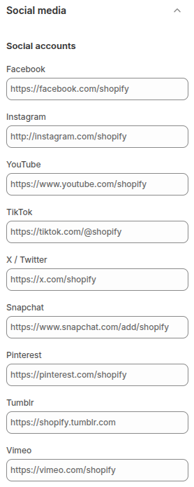
The Social media settings allow you to connect your store with various social platforms. By entering the URLs of your social profiles (such as Facebook, Instagram, YouTube, TikTok, X/Twitter, Snapchat, Pinterest, Tumblr, or Vimeo), customers can easily access and follow your official pages directly from your store.
This feature helps customers stay updated with your latest products, featured collections, and discount policies directly through your social media channels.
4.13 Search behavior
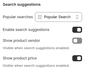
The Search suggestions settings improve the shopping experience by showing customers relevant results as they type in the search bar. You can enable or disable suggestions, display popular searches, and choose to show additional details such as vendor names or product prices directly in the dropdown.
- Popular searches: Choose to display commonly searched terms to help guide customers toward trending or frequently viewed products.
- Enable search suggestions: Activates real-time search suggestions as customers type, making it easier to find relevant products.
- Show product vendor: When enabled, the vendor/brand name of products will be displayed in the suggestions (only visible if search suggestions are active).
- Show product price: When enabled, the product price will appear alongside search suggestions (only visible if search suggestions are active).
4.14 Currency format
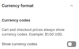
The Currency format setting controls how prices are displayed across your store.
- Show currency codes: When enabled, currency codes (e.g., USD, EUR) will be shown alongside prices in most areas of your store, including product pages, collections, cart, and checkout. This helps provide clarity for customers, especially in international stores.